
It can be frustrating using Signalflow for the first time. Charts appearing with no data, or detectors going off that shouldn’t, and stuff not making sense. If you’ve ever stared at a flat line (or no lines!) on a chart wondering why your metrics aren’t showing, or been confused about why aggregation doesn’t work as expected, this post is for you.
If you are not familiar, SignalFlow is the query language used in Splunk Observability Cloud for analyzing metrics.
I’ll assume you are:
- Using Splunk Observability Cloud metrics with Signalflow queries.
- Want to observe how your services are performing, if there are bugs, performance issues or service degradation.
This post aims to get you to a place where you can quickly troubleshoot queries, avoid trouble in the first place, and spend less time on this part of your job. To do that, I go over some key concepts, that once you understand, will solve most puzzling things about your Signalflow queries not doing the right thing.
The concepts are listed below, and we’ll tackle them one by one.
Metrics – Basic Definitions
Let’s define a couple of terms related to metrics:
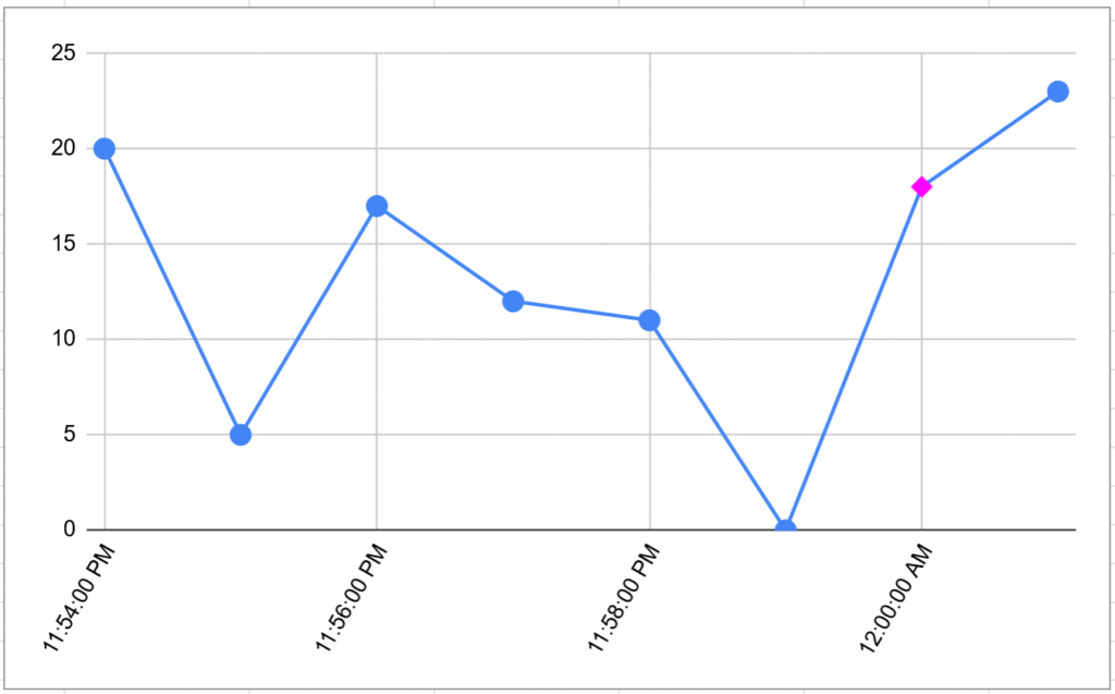
A metric is a single measurement at a specific point in time, e.g. (2026-01-04 00:00:00, 18), visualized here, with metric shown as pink diamond:
A metric data point is a metric with some metadata. It has the following values:
- Timestamp — the time — usually to 1 second precision, can be lower resolution if configured.
- Metric value — e.g. 15
- Metric type — can be
counter,cumulative counter, orgauge:- A counter counts events since the last report
- A cumulative counter counts events since process start
- A gauge measures a value at a point in time (e.g., current CPU usage)
- Metric name — e.g.
cpu.idle - Dimensions — a set of key-value pairs to tag the data point. Can be anything, example is
aws_region:us-east1
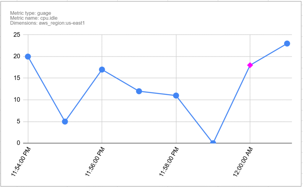
This is shown below. It is the same chart as before with the additional metadata, and the pink diamond is now the metric data point:
Metric Time Series, or MTS
A metric time series (MTS) is a collection of data points that have the same metric and the same set of dimensions. In other words, it is a series of Metric Data Points. For example:
| Time | Value | Details |
| 11:54:00 PM | 20 |
Metric Name: |
| 11:55:00 PM | 5 | |
| 11:56:00 PM | 17 | |
| 11:57:00 PM | 12 | |
| 11:58:00 PM | 11 | |
| 11:59:00 PM | 0 | |
| 12:00:00 AM | 18 | |
| 12:01:00 AM | 23 |
There is an MTS for every recorded combination of:
- Metric Name, e.g.
cpu.usage - Metric Type, e.g.
gauge - Unique set of dimensions, e.g.
hostname:server1,location:Tokyo
Note: it is possible to have two metrics with the same name and different types, but it is best not to do that. They discourage it in the docs here.
Dimensionality
There is an MTS for every combination of dimension values. The number of MTS grows quickly as dimensions are added, or new values added to dimensions.
For example, if you have a metric, with a server dimension with 100 values, and an operation dimension with 50 operations, and all combinations get used, you have 5000 metric time series. Having thousands isn’t necessarily a problem, but having many millions might be.
This is why we try to avoid high dimensional in metrics. For example if you use a URL as a dimension, the problem could be it may include query data, e.g. /user/1003332/post/8883 which would create a lot of time series.
Data Blocks
Now we know how the data is represented, the start of any SignalFlow query is the data block. The data block is where you define which metric(s) you want to gather data from, what filters you want to apply.
For example:
data('cpu.utilization',
     filter=filter('host', 'hostA', 'hostB') and filter('AWSUniqueId', 'i-0403'))
This creates a data stream based on the metric cpu.utilization, and uses filters to only pick up data for specified values of dimensions. In details:
- The
datablock defines that we want to extract data from MTS, and specifies the name of the metric. - The
filterparameter defines how we want to filter all the MTS streams down the the ones we need. - The output of this is the collection of MTS streams for the metric name that have the dimensions specified by the filter.
This is combining the various MTS into a single stream. In this case, it is combining all of these:
- All
cpu.utilizationMTS withhost=hostAandAWSUniqueId=i-0403 - All
cpu.utilizationMTS withhost=hostBandAWSUniqueId=i-0403
If there are other dimensions, then there can be multiple MTS with the same host and AWSUniqueId that need to be combined.
The data block produces a stream, but to produce a chart the engine must bucket values up into time intervals, e.g. 1 minute or 1 day. What is the time interval set to? Can you control it? On to that next.
Resolution
The resolution defined the period of time MTS are bucketed in to for analysis. For example it could be 1 minute, and therefore the Metric Data Points will be aggregated into 1 minute buckets for the purpose of charting and rollups.
The use of an unexpected resolution can easily trip you up, especially when using detectors and debugging why a detector did or didn’t go off given the sent data. We might cover detectors in a future post, but if you are not familiar they are rules to trigger alerts on certain conditions.
SignalFlow usually determines the single resolution for a job by following these steps:
- Determining the resolution for long transformation windows or time shifts that retrieve data, for which only a coarser resolution is available.
- Analysis of the resolution of incoming metric time series.
You can control the resolution in part 1 by using the resolution parameter of the data block. Resolution coarseness caused by Part 2 is also worth watching out for, you can experiment and remove time shifts etc and see if this reduces the resolution to what you expect.
Here is an example of setting a 1 hour resolution on a datablock:
data('cpu.utilization',
     filter=filter('host', 'hostA', 'hostB') and filter('AWSUniqueId', 'i-0403'),
     resolution='1h')
Rollup vs. Analytics
There are two types of aggregation that happen in Signalflow, and this really had me puzzled for a while, as why do I want to aggregate twice, and what happens if I choose a different aggregation for them?
The difference is Rollup aggregates over time, and analytics aggregates over dimensions. Let’s dive into that a bit more.
Rollup
A rollup decides how to aggregate the MTS into the given time resolution. For example given this MTS from earlier, let’s do an average rollup over a 2 minute resolution. The result is every 2 minutes, we take the mean average of the (in this case) 2 values. Here is the original MTS again:
| Time | Value | Details |
| 11:54:00 PM | 20 |
Metric Name: |
| 11:55:00 PM | 5 | |
| 11:56:00 PM | 17 | |
| 11:57:00 PM | 12 | |
| 11:58:00 PM | 11 | |
| 11:59:00 PM | 0 | |
| 12:00:00 AM | 18 | |
| 12:01:00 AM | 23 |
Here is the rollup:
| Time | Value | Rollup |
| 11:54:00 PM | 20 | 12.5 |
| 11:55:00 PM | 5 | |
| 11:56:00 PM | 17 | 14.5 |
| 11:57:00 PM | 12 | |
| 11:58:00 PM | 11 | 5.5 |
| 11:59:00 PM | 0 | |
| 12:00:00 AM | 18 | 20.5 |
| 12:01:00 AM | 23 |
For the example we only looked at one MTS, but of course the rollup applies to all of the combined MTS in the query. The resolution as mentioned earlier is determined by factors including the original stream resolution, the specified resolution in the data block, and any other operations that may make the resolution courser.
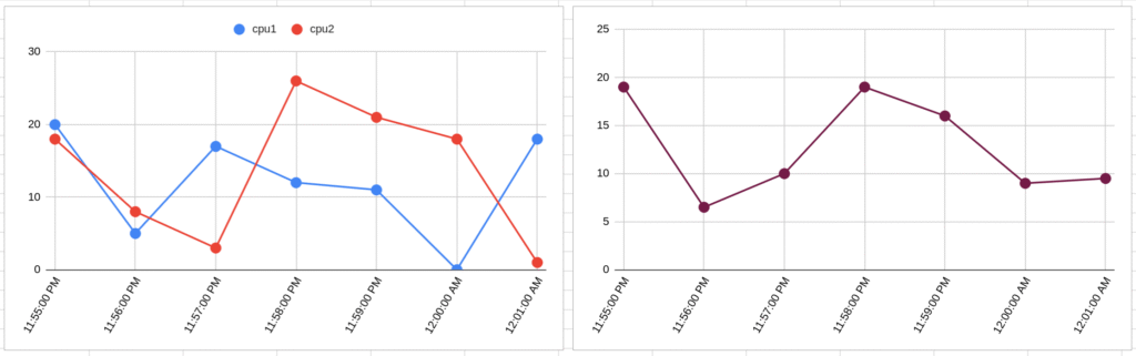
Analytics
Analytics methods allow you to aggregate again—this time over dimensions. By default, i.e. if you don’t use analytics, you get a stream for every single combination of dimensions. You may sometimes see charts with so many colored lines it is hard to read. These probably have not been aggregated using analytics.
You can aggregate all of those lines into a single line using an aggregation function of your choice. Choices of function include count, floor, mean, delta, minimum and maximum. More details are here.
The example below shows this, on the left, without analytics, there are 2 MTS shown as separate lines. If we then apply the mean analytic function, we get a single line with the mean:
As signalflow code, these would look something like:
data('demo.cpu.utilization').publish('chart1')
data('demo.cpu.utilization').mean().publish('chart2')
Maybe you don’t want to collapse all lines into one line? Then you can also choose to group by dimensions. For example if you have MTS with dimensions for cpu number and host, you could do this:
data('demo.cpu.utilization').mean(by=['host']).publish()Which would give you the average cpu utilization across cpus for each host.
Hopefully this helps you get started with Signalflow. Finally here are some entry points into Splunk documentation if you want to read more:
- Splunk Observability Cloud Help
- data() block
- Data resolution and rollups in charts
- Overview of Metrics
- Getting Started With Metrics
Image by PublicDomainPictures from Pixabay